Wednesday, 27 June 2012
Pre-Production
I have learnt that organisation is the key to producing a good music video. I didn't realise how
difficult it can be to make sure that everyone in the class had a roll. We also had to rely on each other
to bring props and costumes in order for the video to be exactly the same. Fortunately there wasn't any
problems as everyone helped each other however there were times where people forgot to bring their costumes which made it harder but manageable.
Production
When it came to actually producing the video I learnt that there is a lot more to it than I thought. After a while I became familiar with the equipment and had an idea of how the shots should be taken in each frame. Even though we had a director who told everyone where to stand or how to act I still found myself and others helping and guiding people to do the right thing for the music video. As I was one of the main characters in the video I had to really make an effort in order to fit my character which was quite difficult at times but after a few takes we got it right.
Post production
When it came to editing our video clips to make it into a music video I learned how to use the software Adobe Premiere Pro Cs5 which I found extremely difficult at the start, but after a while I got the hang of it and didn't have any trouble using it when editing. I learned how to shorten and widen video clips and also found out how to speed up shots or put them in slow motion. I found that making sure the lip syncing was in time was quite difficult and frustrating at times but as I said after a while I was able to do this quite quickly which made the whole thing a lot easier.
Friday, 15 June 2012
A2 media studies lip syncing exercise
The task was to choose a song and then accurately and efficiently lip sync the lyrics to the song. The task had to be the first section of the song just to illustrate that we are capable of lip syncing. The task showed me that lip syncing is very challenging because you have to sing the lyrics to get the best effect and you have to sing with confidence. I also discovered how difficult it is to edit the video so the lyrics fit the mouth movements in time. The filming had to be medium close ups or close ups so you can see the mouth area in detail. The software that we used (Adobe Premiere Pro) was very complex and difficult to use, but after some practise we adjusted to it.
Thursday, 23 February 2012
Looking back at your preliminary task, what do you feel you have learnt in the progession from it to the full product?
When planning and preparing my magazine I found this time round I was able to put a lot more into my research and drafting, especially as I had more time, meaning I could put a lot of effort into it to produce something at a high standard.
I found that during this project my organisation of time was a lot better, as I was able to organise all of my work and set deadlines using time toast and regular updates which I wasn't able to do in the preliminary project.
Since my first project i would say I have definitely learned a lot more about using the camera and different frame shots, angles and lighting as for this project all of that was crucial in order to produce the magazine cover, contents page and double page spread at a high level. I was also able to spend a lot more time concentrating on the lighting effects when taking the photos, which was very helpful as it made my images look a lot more professional.
I think I have definitely learned a lot more about the different conventions of magazines as I was able to spend a lot more time researching different mags so I could see what is typical of a music magazine. Especially as when I started my preliminary task I found it quite difficult to produce a good front cover and contents page as I wasn't too sure of what should be included.
When I made my magazine cover and contents page for the preliminary task I had to use photoshop for the first time. I found it very difficult to use and wasn't able to do things that I wanted for instance air-brush the students face. However, after this project I feel I have learned a lot more about photoshop after having plenty of time to practise trying out different effects and image manipulation so this time round I was able to do everything I wanted to do to the model, including airbrushing and cropping.
I also feel that my awareness of how consideration of the target audience determines the outcome of decisions made during the production process has improved as when I was making my magazine for this project I changed my mind on various ideas and only included certain things in my magazine because I knew exactly who I was aiming it at whereas with the preliminary project my audience wasn't so specific meaning I did things that may not have suited my audience.
I think the biggest thing I have learnt from undertaking this project would probably be how there is much more to magazines than I thought and that all magazines are very different from each other depending on who it is aimed at and that everything is done for a reason.
I think I have definitely hit my targets as one of them was "there should have been a shooting schedule plan, which I will need to take into consideration for the next project." and I did make a shooting plan this time round which included shot lists and a lot of information on locations and props.
5) How did I attract/address my audience?
I think I definitely succeeded in attracting my target audience as when I showed a few mixed gender teenage classical music fans my magazine I got quite a good reaction and some good positive feedback. When I asked them about it, all of them straight away knew that it was a classical music magazine, and found the colour scheme very effective as the use of black, white and red could apply to both sexes and come across as quite classy looking - as said here -
When I asked a couple of people from my focus group about the font styles and images used I also got this reaction -
I was quite pleased after hearing this as I wanted my font styles to look cool and adult looking as my magazine is aimed at a more sophisticated, upper-class audience so I know I have done a good job in doing so. It was also quite gratifying to hear that it was clear to people who looked at the magazine that it is aimed at teenagers which is great as I made sure my magazine didn't look too adult as I wanted to challenge conventions by finding a gap in the market.
4) Who would be the audience for my media product?
The audience for my magazine would be both male and female teenagers who are radical individualists, traditionalists and achievers who fall into the c1/B category on the jitnars scale. My audience would be very much into classical music, and may play an instrument as they would be quite ambitious. They would not be the kind of listen to mainstream music or wear quite common clothes as fashion would be something they'd be very interested in. They might be interested in activities such as socialising, reading, photography and collecting vintage comics and retro antiques.
Friday, 3 February 2012


Thursday, 26 January 2012
Double page spread: update
IMAGE
I have now taken the photos of the boys for the double page spread and they have come out really well. I have also decided to use one of the photos for the contents page as I needed an image of the three of them together. After looking at all the images I have decided to use the one of them standing in line looking into the camera as this looks very dramatic and climatic.
COLOUR SCHEME
This time round I have decided to use the colour scheme of mainly greys, whites and black. I think this is a good idea at the image isn't that colourful, and the background of the double page spread is grey, so white writing against it will stand out and so will the title of the page.
Tuesday, 24 January 2012
Contents layout: update
IMAGES
1) Main image: This will be a photo of our original band member Martin Welsby playing the piano, as this suits the magazine perfectly as it is classical.
2) This will be a picture of Billy, posing in the photography room, as this will feature in the double page spread with the band interview.
3) A photo of the band itself including Tom Baldwin, Billy Francis and Reece Lane for the double page spread
4) Photo of Carla 'Aria Tesolin' smiling at the camera
5) Image of Dan Caldwell, a new member to the focus group who will be a composer in the magazine
6) Image of the classical music book
7) Dan Childman, another member to the focus group will be posing for a reviewer.
COLOURS
As the colour scheme for the front cover is going to be red, white and black, I am also going to carry this further by having this colour scheme for the contents page also. I quite like the colours as it is very classy looking, but not boring as it includes one striking colour and the white writing against the black background is also quite eye catching.
FONTS
again for the title I have decided to have it in perpetua titling mt to carry the pattern of font and colour on. I have also decided to have the captions for the little images in Cambria math as this looks very upper-class as it is in serif and also looks clear and legible against a coloured background in a small size.
I am planning on including a quote on my contents page which will be in Minion pro, but semi bold italic and in a slightly larger font than everything else so it stands out and looks very stylish.
Contents layout
I have decided to change the layout of my contents page as my original plan was to have it in the style of the Gramophone music magazine. However, I have thought it over and I think this is a little too boring especially as this magazine is going to be aimed at teenagers. So I have decided I am going to be doing it in the style of the Classic fm magazine as this includes a lot more images, and is also very interesting, as well as sophisticated looking. This means I am going to need 7 images for my contents page.
Sunday, 22 January 2012
Front cover photo
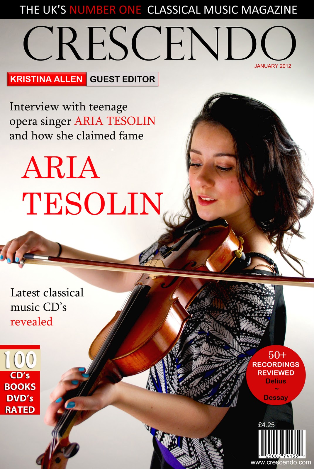
I have now taken my photos of Carla playing the violin in the photography room and I am quite pleased with the results. I have decided to stick to my original plan of her standing to the right with the violin in her hand as this will look great, especially if I have the majority of the writing going around her, leaving her the focus of interest. I have chosen out of the few photos of her which one I am going to use and I am now going to Photoshop her and change the lighting and contrast of the image to suit the magazine.
Saturday, 21 January 2012
Title for front cover

1) Minion Pro
2) Perpetua titling mt
3) Trebuchet MS
4) Andalus
5) Times New RomanAfter looking at all 5 of these and trying them out on the front cover of my magazine I have decided that the second one (perpetua titling mt) is the best as it is very sophisticated looking, striking and is also in serif, which automatically makes it look classier. I think that I am going to use serif in nearly all of my pieces of text to give that upper-class feel.
Thursday, 19 January 2012
Performers and Casting: update
I have decided to change the number of people in the band that I am going to take a photo of and have for my double page spread as I feel 4 is a little crowded. I have decided to keep Tom Baldwin and Billy Francis and I have added a new member to the group Reece Lane to take Jack Dents place as he won't be available at the time I go to take the photos. I think this amount of people will suit the page better as it will be a little more spaced out and there will be a lot more focus on the picture.
Costumes and Props: update
CARLA
I have decided to change Carla's outfit for the front cover, as what I originally planned (white top and black blazer) is a little boring and I'd like to add some colour to the page so I have asked her to bring in quite a colourful top, that's still quite classy and sophisticated.
BOY BAND
I have now asked the boys to bring in different outfits as I think white shirts and black trousers is a little too sophisticated. So now they are going to bring smart casual clothes instead. I have also decided that I am not going to take a photo of the boys holding instruments as I think it will look better if I just have them standing there focussing on the camera as this looks a lot more classy and it's easier to tell they are a boy band.
Tuesday, 17 January 2012
Titles for my magazine (2)

I have decided to use the word 'Crescendo' for the title of my classical magazine as this was the most popular suggestion from my feedback. Also, the word crescendo means a gradual increase in volume and intensity which suits my magazine as classical music does the exact thing, and the word also mimics the magazine itself especially as I want it to be quite intense and eye catching as it's for a younger audience.
Titles for magazine

I have found on the internet different classical music related words that could be used as a title form front cover of the magazine and am now deciding which one to use.
CLASSICISM - Traditional genre of music conforming to an established form and appealing to critical interest and developed musical taste
CAPPELLA - Music without instrumental accompaniment
CHROMATIC - Relating to chords or harmonies based on nonharmonic tones.
ARABESQUE - Music An ornate, whimsical composition especially for piano.
SLUR - To glide over (a series of notes) smoothly without a break.
CRESCENDO - A passage played with a gradual increase in volume or intensity.
Monday, 16 January 2012


Tuesday, 3 January 2012

Locations
 Front cover - Will most likely be taken in the photography room at college and a short letter will be posted later on to say I have permission to use the room for taking photos.
Contents page
1st image - Will most likely be needed to be taken in the photography room again
2st image - Will be taken in the music room at college and permission will be posted on the blog soon
3rd image - against a white background (can be taken anywhere)
Double page spread
1st image - will again be taken in the music room at college
2nd image - will either be taken in the music room or in the photography room at college
Time Management: update
Costumes and Props (1)
My set deadline- 1/1/12
= deadline met
Costumes and Props (2)
My set deadline- 1/1/12
= deadline met
Costumes and Props (3)
My set deadline - 3/1/12
= deadline met
My set deadline- 1/1/12
= deadline met
Costumes and Props (2)
My set deadline- 1/1/12
= deadline met
Costumes and Props (3)
My set deadline - 3/1/12
= deadline met


Sunday, 1 January 2012
Costumes and Props (2)
COSTUMES - for Carla Hughes
I called Carla and discussed what she is going to wear at the shooting for the front page and contents page and have come up with these ideas

I called Carla and discussed what she is going to wear at the shooting for the front page and contents page and have come up with these ideas

Costumes and Props (1)
COSTUMES - for Tom Baldwin, Martin Welsby, Jack Dent and Billy Francis
After speaking to all four boys, they have all given consent to bring in their own clothes to wear at the shooting for the contents page and double page spread images.


Time Management: update
Detailed Research into Forms and Conventions
My set deadline- 20/12/11
= deadline met
Audience Research
My set deadline- 22/12/11
= deadline met
Audience Focus Group
My set deadline- 28/12/11
= deadline met
Planning: First drafts
My set deadline- 30/12/11
=deadline met
Audience Research 2
My set deadline- 30/12/11
=deadline met
Performers and Casting
My set deadline- 30/12/11
=deadline met
Subscribe to:
Posts (Atom)